UI design practice:
Maple Leaf Careers
Problem
Before starting my job in September 2018 as a Digital Designer at Maple Leaf Foods, I was given a small design challenge as a warm-up. The purpose of this was to become acquainted with the company's branding and style, and I was told to use their main website as a guideline.
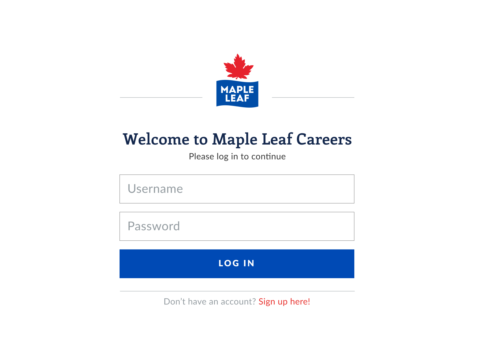
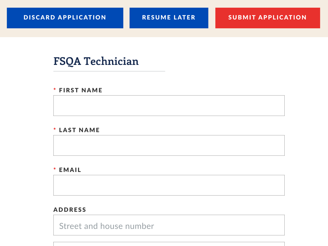
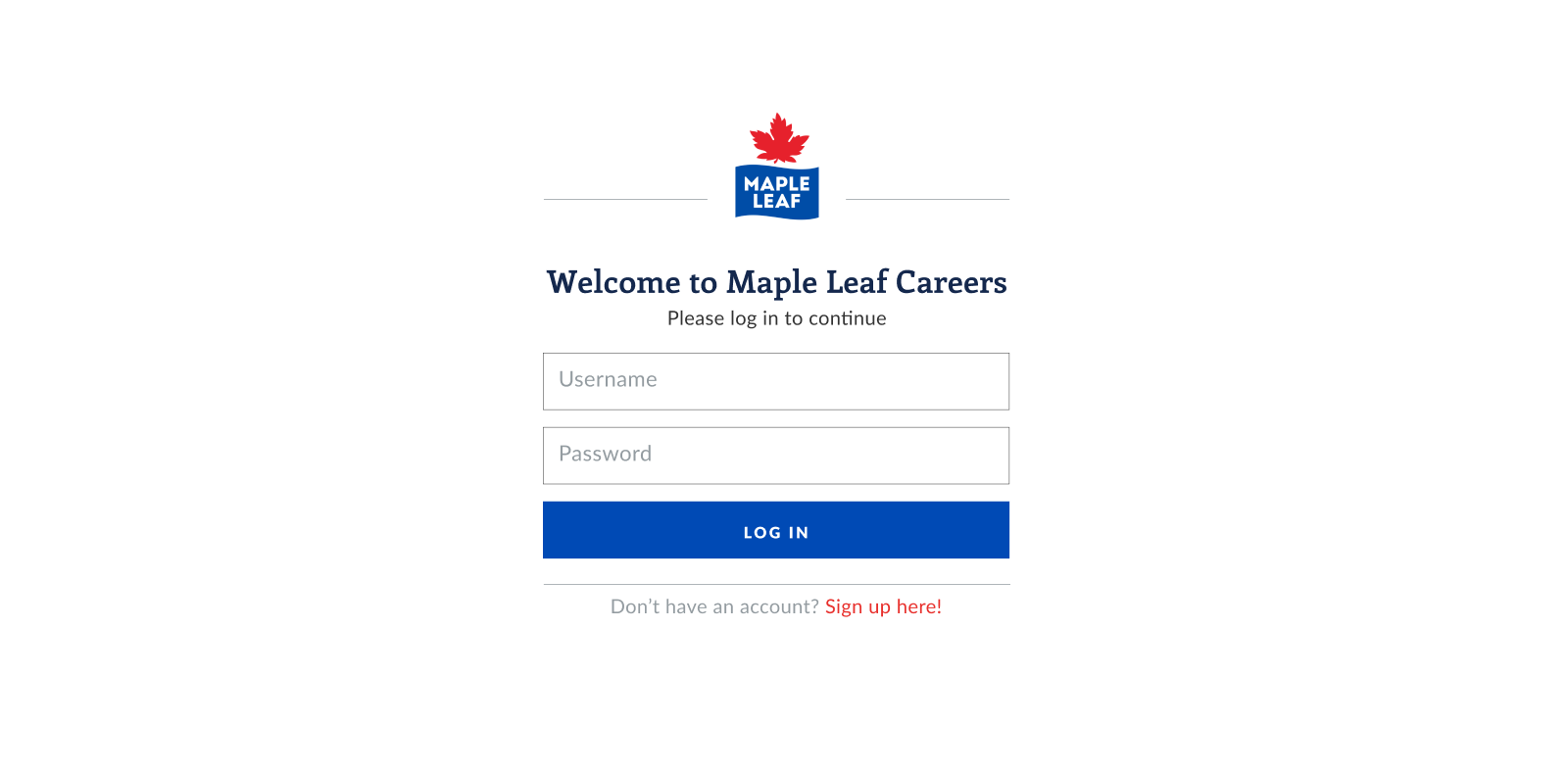
The challenge was simple: create a small mockup of a tablet app that users could log into for searching and applying to job openings at the company.
Process
The first step was to familiarize myself with Maple Leaf's main website and take note of any existing layouts and design elements that could be useful in designing the mockup. At the time, the website looked like this:
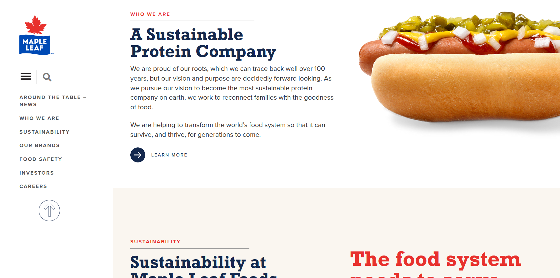
I started by taking note of the colours and fonts being used, and for what type of text. I also noticed the circular icon-only button style, and a coloured website background for certain sections providing separation between segments. Drawing inspiration from this, I started to build reusable components for the interfaces using Figma.
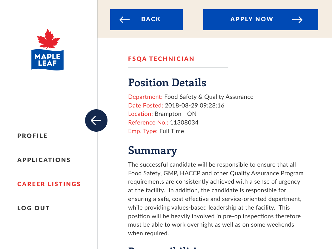
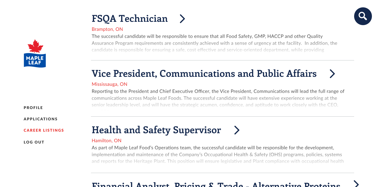
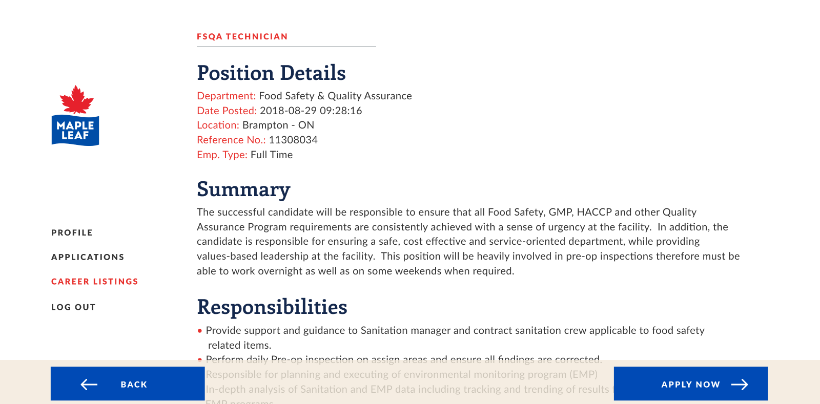
I sketched out various ideas for the required screens while continuing to reference the main website for design elements. For example, I wanted to implement a menu for users to navigate between the job list and their job applications, so I borrowed the main website’s left navigation style. However, it still had to be adapted – for example, I moved the search button from the menu to the top-right of the job listing screen, since it would be used to search the listings and not the entire app/website. I also made the menu collapsible to allow the user to focus on reading job descriptions if needed, especially since tablets are more limited in screen space than desktop devices.
To avoid horizontal dividers from “clashing” with the vertical menu line, I decided to use the coloured background seen on the main website to alternate between adjacent job postings. The intent was to also introduce some visual interest to the job list, drawing the user’s attention there.
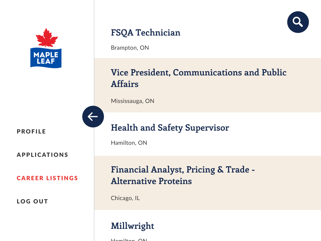
One challenging aspect for me was that I do not own a tablet myself, so I lack an intuitive sense of how big the screen is or how to properly size the design elements. Looking back, I should have referenced successful tablet designs to check things like font and button sizes.
Bonus - Desktop Version
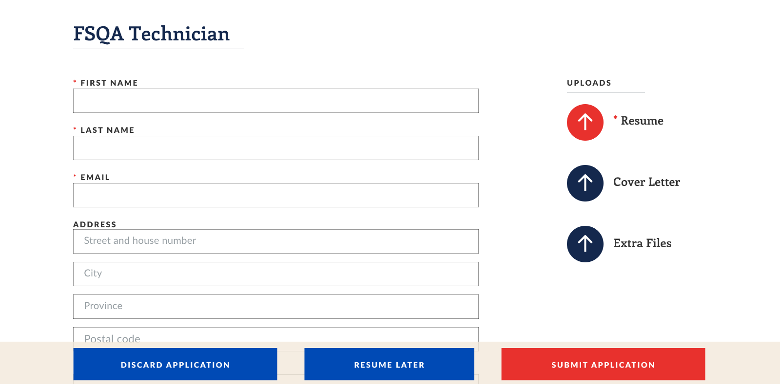
While not in the initial challenge, I also came up with a desktop version as a bonus. The larger screen size allows for some notable design changes. More whitespace could be added around the menu and there is no longer a button for collapsing it, reducing visual clutter. The wider screen allows for a job description preview to be shown while browsing, giving users more information before having to click on the individual posting. This added text does introduce more visual complexity, however – so the coloured backgrounds were removed and replaced by slim horizontal dividers. Finally, on the application page, upload buttons were moved to a new column on the right.
Reflection
While I am mostly happy with how this challenge turned out, there are areas for improvement. I actually liked my desktop version better than my tablet version, which I believe is due to my lack of experience in designing for tablets. For example, one way to improve the usability would be to move the navigation bar from top to bottom on the tablet version, as users may find it easier to reach. I also likely made the job title text too large in the list view and could have included more job information at a glance. In general, it would have been nice if I could test out the tablet version on a real tablet to truly get a feel for scale and what the user would experience. However, in terms of visuals and branding, I would call this design exercise a success, largely in part to the company’s existing visual style. It familiarized me with the branding I would be using for the next four months as a designer.
Note: all job information used in these mockups was taken from the real Maple Leaf Careers website, which has been moved to Maple Leaf’s main website.