Motivation
As part of a UI design course, I had to design an interface for an open-ended final project. I decided to redesign a part of Quest, my university’s administrative system – more specifically, its course selection interface and process. This idea was widely fuelled by my own experiences with the system. As one of its primary users, I could already pinpoint a variety of problems and frustrations with the UI, ranging from superficial unattractive design to more concerning issues such as confusing navigation. The website is in major need of a redesign in many aspects, though undertaking such a task would be too large to tackle for this project. Thus, the scope was narrowed to focus on the portions of the experience dedicated to adding courses, specifically for undergraduate students.
User Requirements
The problems with Quest could not be based solely on my personal opinions - requirements had to be further investigated with additional users to produce a more unbiased view of the system and pinpoint key areas to fix. User requirements were compiled using a combination of three methods:
- A user survey to collect large-scale data about opinions of Quest
- User interviews to recount personal, detailed experiences and feelings from users
- A task analysis of a commonly performed action in Quest: adding a course
The most important insights gathered from the survey were, in summary:
- The most disliked aspect: “Things are hard to find”
- The most desired features:
- Course descriptions
- A list of available courses
- ^ …it turns out these features already exist in Quest, but nobody knows about them
- 72.7% strongly agree there are too many websites/resources that need to be referenced when selecting courses
All 3 primary users that were interviewed:
- Do course selection on desktop/laptop, never mobile
- Mix up “Enroll” and “Course Selection”
- Get confused by the Quest interface
- Use resources outside of Quest to help make choices
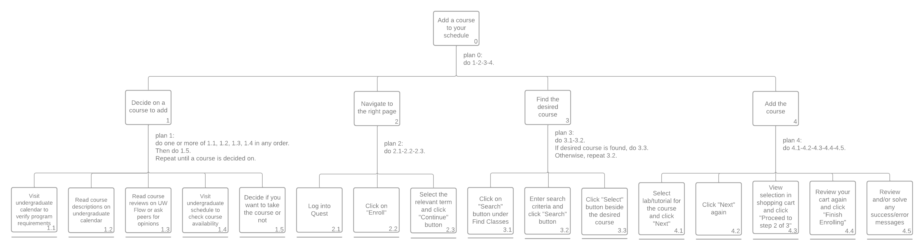
Based on the user interviews, it seemed like the most common - yet still complicated – task performed in Quest was adding a course. To analyze the task, a task analysis tree was created, as shown below. This tree was compiled using processes described in the interviews and by manually going through the task on Quest to confirm details. The task requires a lot of steps, seen visually from the width of the analysis tree.
The requirement gathering methods allowed me to further narrow the project scope and focus specifically on the course adding process. The scope will also focus on a desktop UI rather than a mobile design.
The findings provide compelling evidence that Quest is in need of improvement due to its confusing nature. Elaborating on this, the current system likely has issues with its organization and navigation, and can benefit from simplification of processes.
Three main usability goals were created from the investigation process to serve as reference for the project:
- Simplified process for adding courses: Is it easy to do?
- Less confusing interface: Is the navigation clear? Are features discoverable?
- Satisfaction: Do users like the new interface?
Navigation Analysis + Simplification
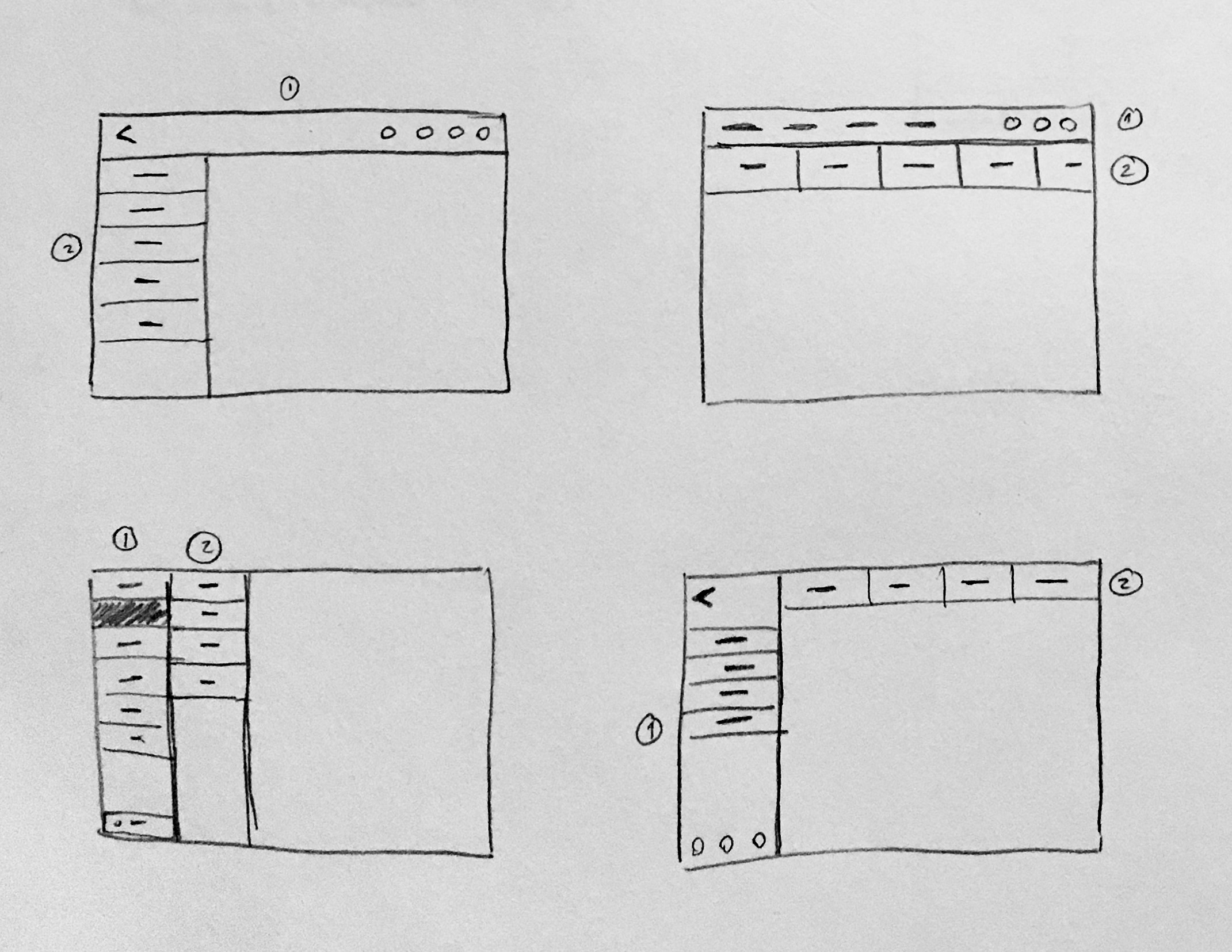
As suggested by the user requirements process, Quest’s navigation may be one of the root causes of its poor usability. Before beginning a redesign, the current navigation menu system was analysed, breaking it down into its base structures.
- Menu 1 contains high-level navigation elements, including two home buttons and a secret collapsible Menu 5.
- Menus 2 (collapsible) and 4 (non-collapsible) contain secondary navigation specific to the current category (eg. Enroll).
- Menu 3 allows for limited navigation between homepage categories.
- Menu 5 (collapsible) only contains a broken button and the signout button.
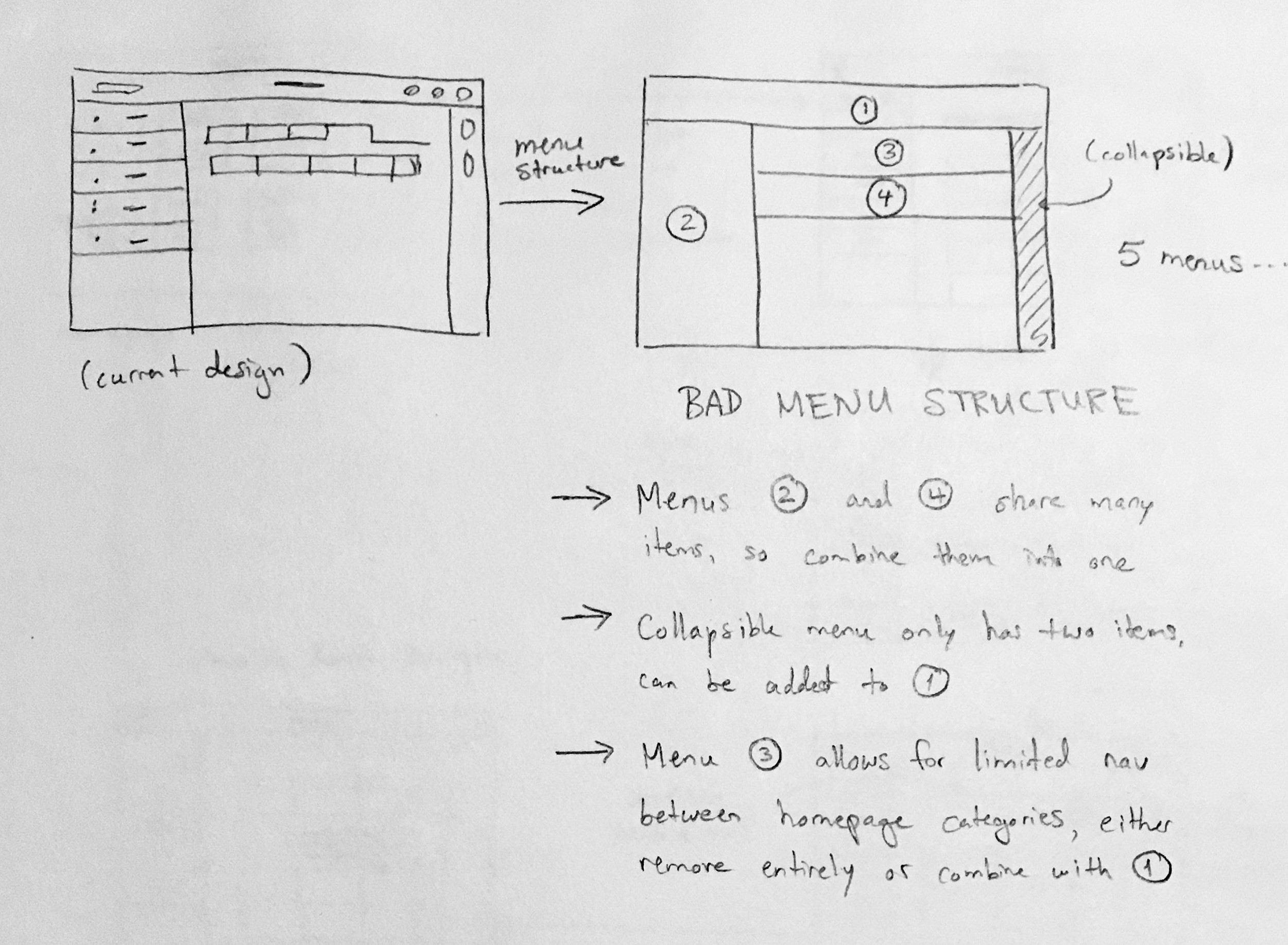
As seen in the rough notes, the first idea I had to improve the navigation was to reduce the number of menus by combining them. I wanted to limit it to two non-collapsible menus, achievable by:
- Combining Menus 2+4, since there is significant overlap in their items
- Combining collapsible Menu 5 into Menu 1, since it only has two items
- Removing Menu 3 entirely, since users can return to the homepage at any time using Menu 1
Rapid sketches were created of potential two-menu layouts, as shown below. The top-left layout was chosen for further prototyping due to its similarly to Quest’s original design, providing a sense of familiarity to returning users.
Prototyping
I also sketched a storyboard to envision a user going through a new and improved Quest interface and perform course selection. The storyboard features both the user and some conceptual UI elements, emphasizing the impact that a streamlined interface has on the user’s experience. The user’s emotions were inspired by users in the interviews.
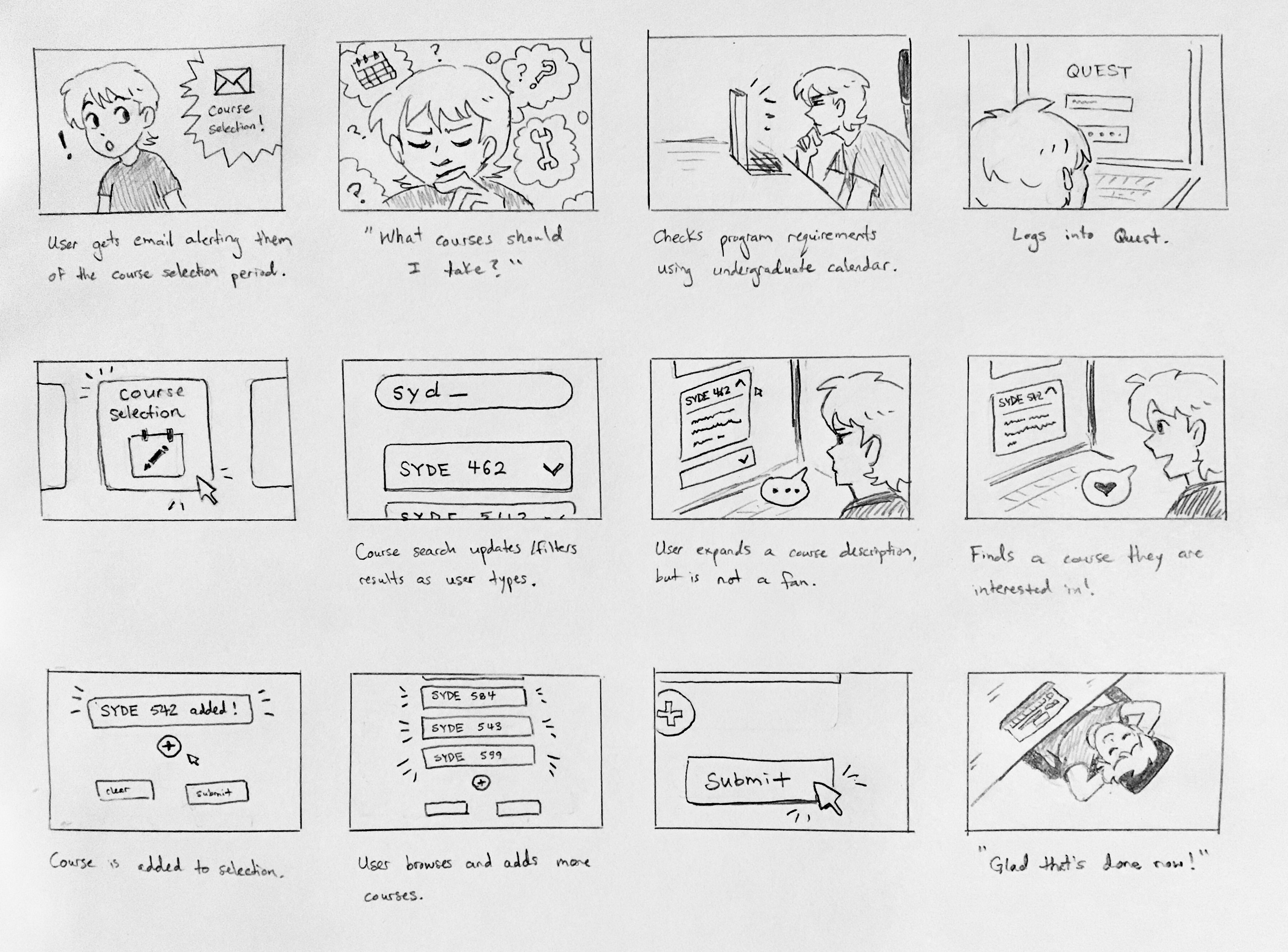
Some of the brainstormed UI improvements shown in the storyboard are a real-time course search and collapsible course descriptions. These features will hopefully allow users to browse for courses more easily, which aids in course selection decision-making and reduces the number of external websites that need to be visited.
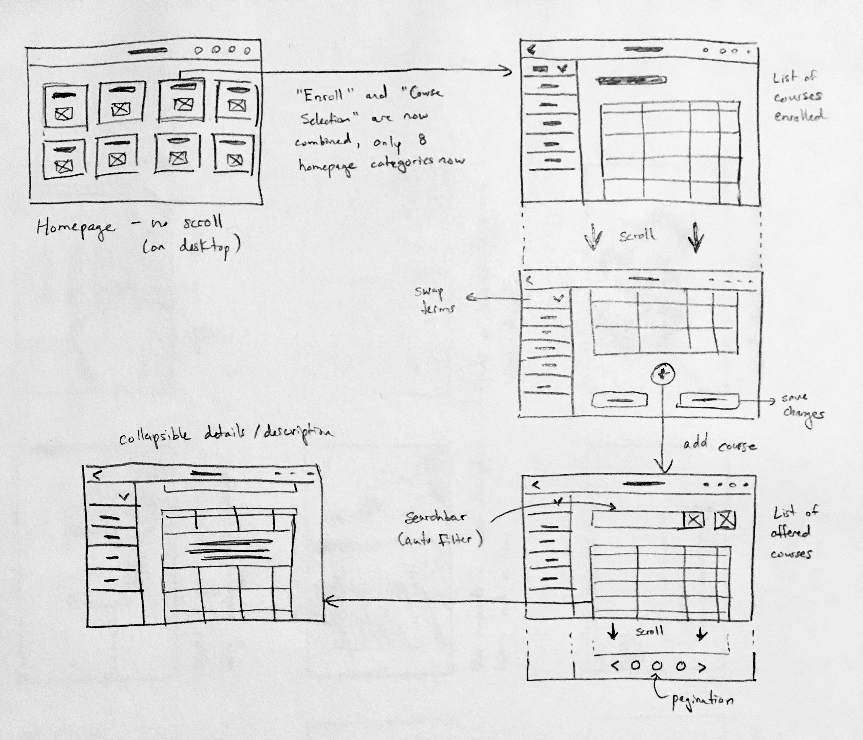
I then refined the redesign ideas by sketching a low-fidelity wireframe. It features:
- The simplified two-menu layout chosen earlier
- “Course Selection” and “Enroll” combined into a single category to reduce confusion, as suggested by users
- Collapsible course descriptions and a real-time course search bar, conceptualized in the storyboard
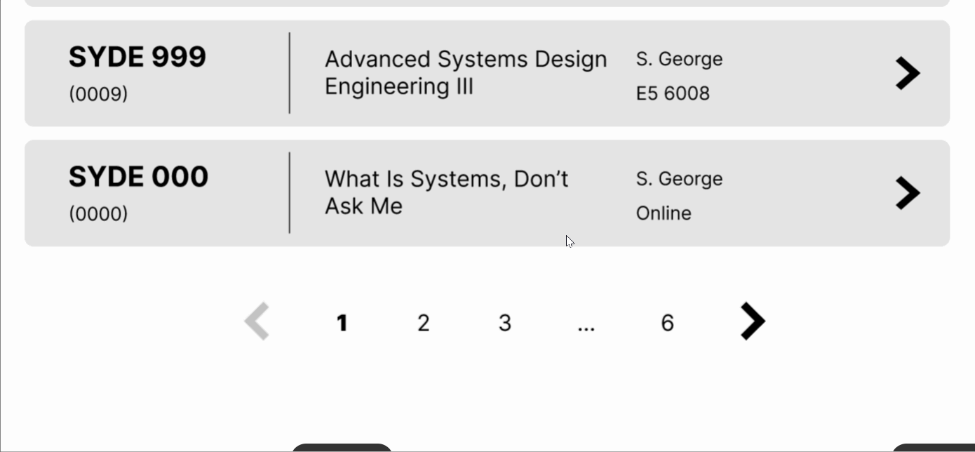
- Scrolling combined with pagination on the course search page (10 courses per page)
- A term dropdown on the left menu
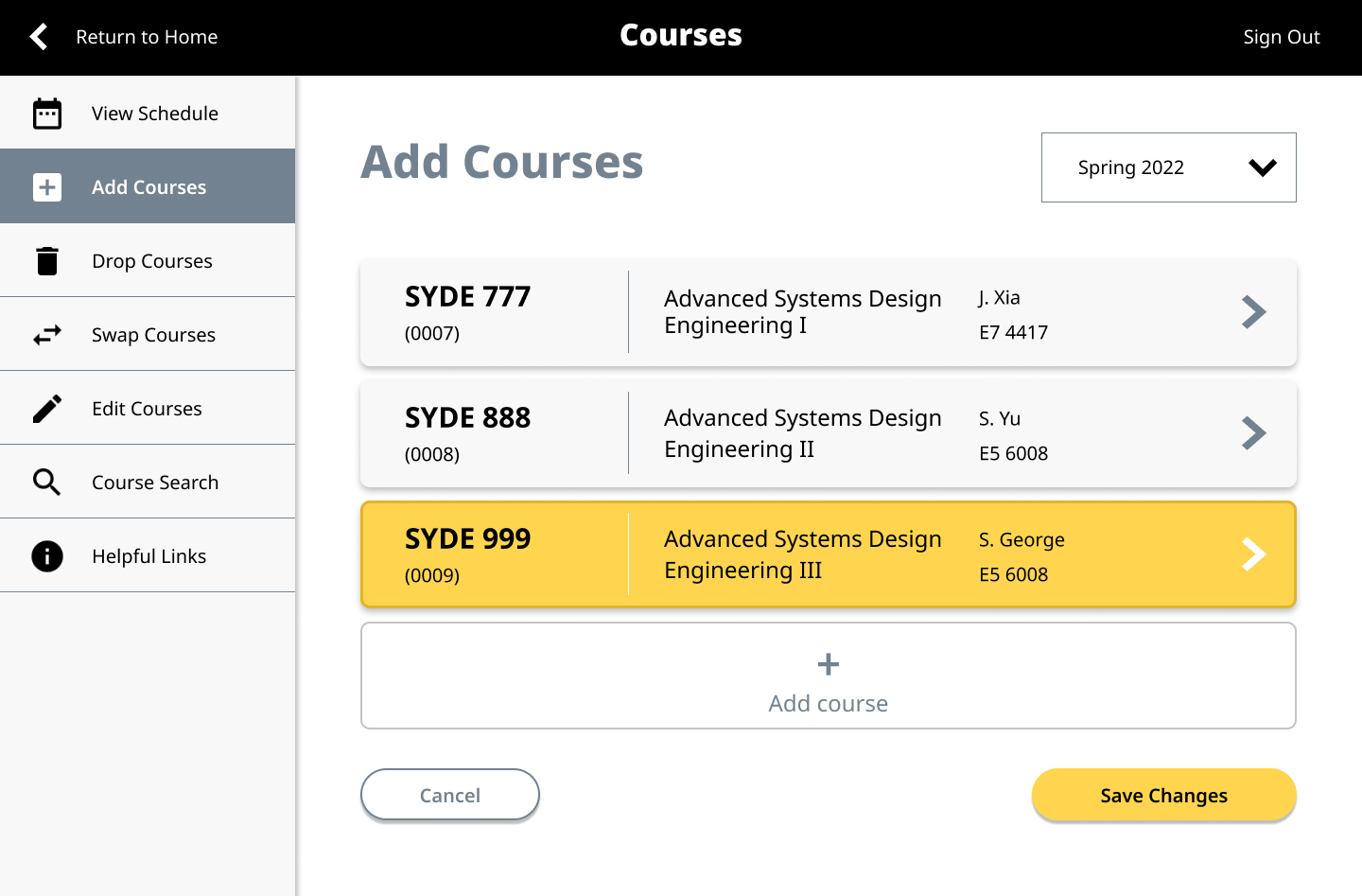
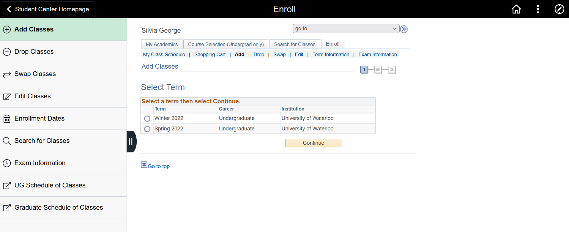
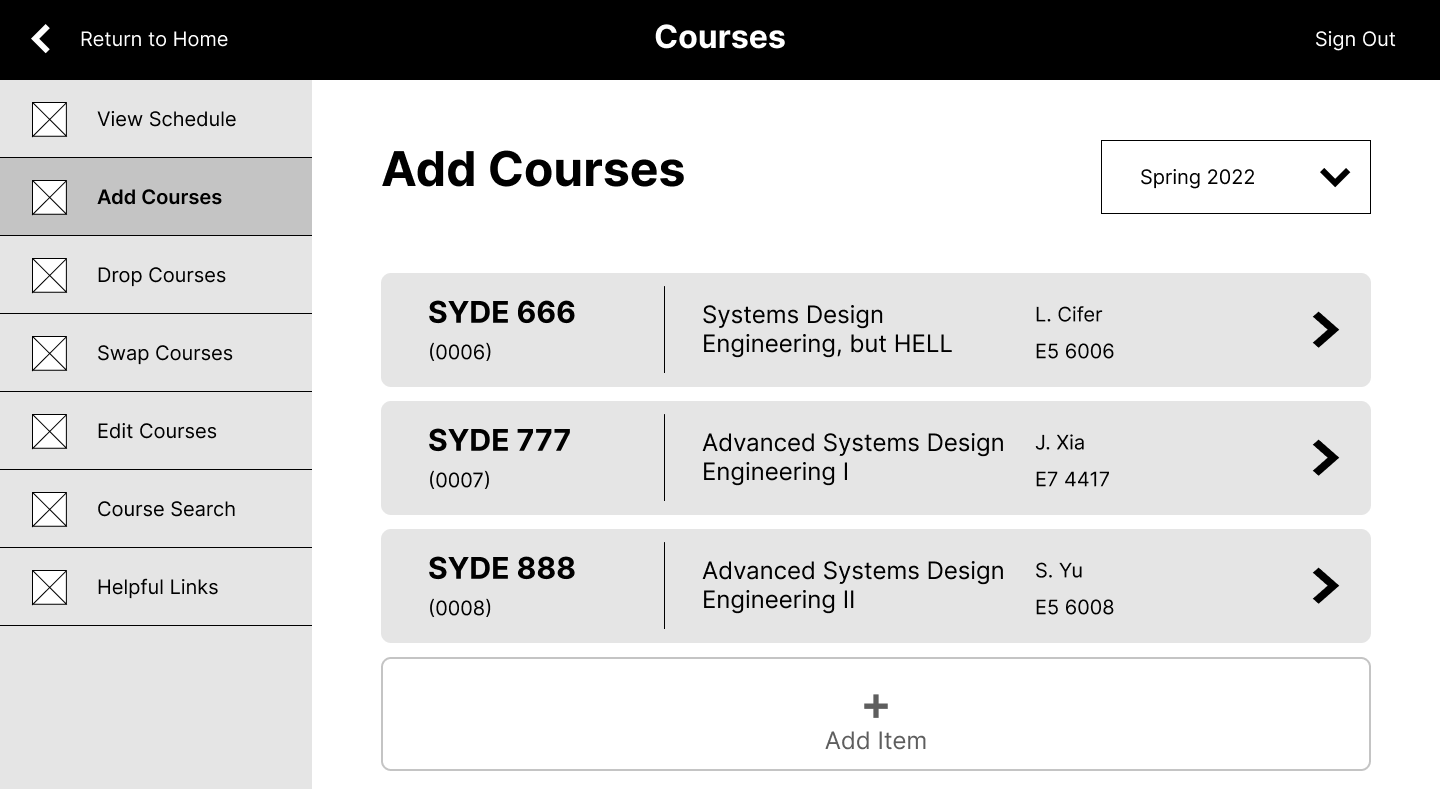
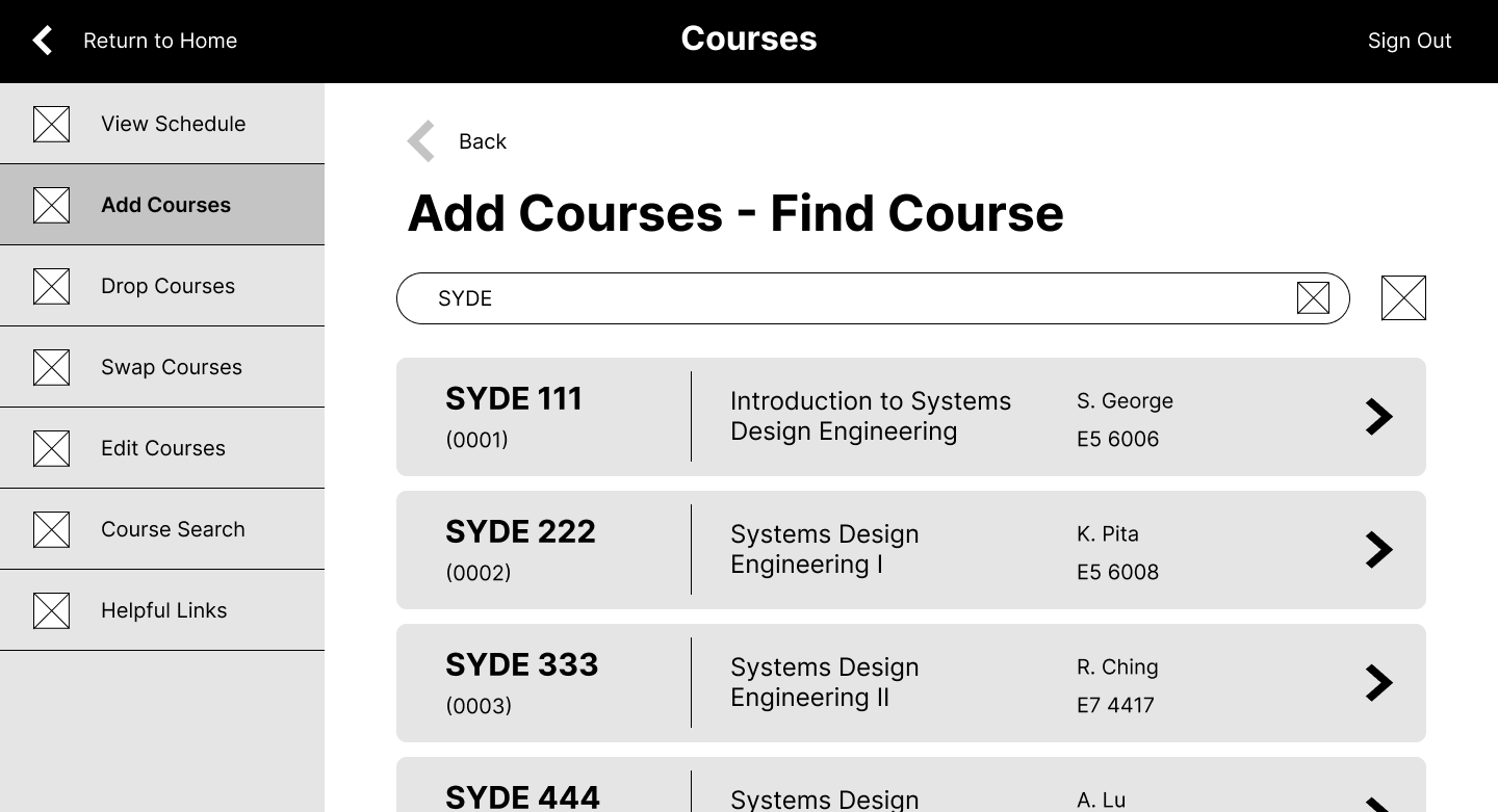
A medium-fidelity wireframe was then created using Figma. More work was put into this than initially anticipated, and the pages were turned into a clickable prototype. You can try it out here.
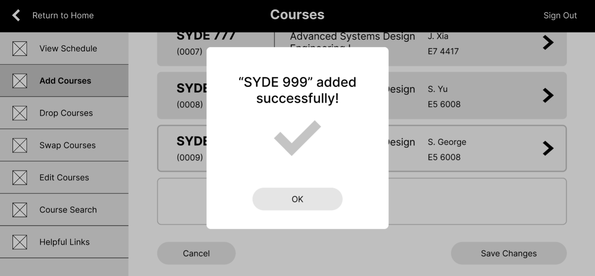
It is essentially a more polished version of the low-fidelity sketch, with a few small changes such as moving the term dropdown to the top right of the main content panel. The prototype allows you to add the course “SYDE 999” to the Spring 2022 term.
Testing
I decided to test the prototype instead of first creating a high-fidelity mockup, since the goals of this redesign focused on base usability rather than polished visuals. Although the initial plan was to do cognitive user walkthroughs, the Figma wireframe ended up being complex enough for more solid task-based testing, which better suited performance testing. In other words – it was “functional” enough that it could be used to simulate a task and collect metrics to evaluate the design before moving onto design refinement.
Benchmarks for testing were created based on the project’s usability goals:
- Simplified process (quantitative)
- Time: all users must take less than 2 minutes to add a course
- Number of steps/clicks: must not be more than the current system
- Less confusing (quantitative)
- Errors: all users should only make a maximum of one navigation error
- Satisfaction (qualitative)
- All users must prefer the new interface over the old one
- The new interface should get better scores than the original Quest survey when it comes to aspects that are liked/disliked
- Task satisfaction should be ranked 4 or 5 by all users (on a 5-point scale)
Three primary users were recruited for this testing, which involved giving them the prototype and asking them to add the fictional course “SYDE 999” to their Spring 2022 term. Metrics like task timing and error counting were collected, as well as satisfaction ratings in a follow-up survey. In general, users performed well on the tasks, and seemed to enjoy using the interface. The follow-up survey revealed that no aspects of the new interface were disliked, and that all users preferred the new interface to the old one. Overall, the prototype passed all of the set benchmarks.
Design Refinement
Since the prototype passed the performance test, it was a good indication that the design idea is a step in the right direction and could thus be explored further instead of returning to an earlier design stage. A visual mockup of a higher-fidelity design was created based on the medium-fidelity one.
Colour was introduced to the greyscale mockups sparingly, mostly used to draw attention to specific elements of the interface. For example, courses that were added but not yet saved are displayed in yellow to stand out from the rest of the list, indicating to the user that something had to be done. Red and green were used to indicate failures and successes at a glance. Yellow and black come from UW’s official colour branding, since Quest is a UW website and should reflect some aspect of that. Overall, colour is meant to enhance the experience, but is not essential to it - a colourblind person should still be able to use the interface given the rest of the design elements.