Background
Tonal languages such as Mandarin can be hard to grasp for learners. A change in pitch can determine whether a word changes its entire meaning – for example, in Mandarin, the sound “ma” can mean mom, cannabis, horse, or scold depending on which tone it is spoken with. Tonal language learners tend to have trouble with perceiving and pronouncing tones, and there are not many digital solutions that specifically offer tonal training.
This problem space was chosen by my team as the basis for our fourth year undergraduate capstone project, which spanned eight months. The resulting project – later named Tonami – was done as part of a group, and my role was the Design Lead. There was a lot of work put in by all the team members, but I will be focusing on my design contributions for the purposes of this case study.
First Design Iteration
After running some Google Sprint ideation sessions, the group collaborated to make this initial design. The solution was intended to be a mobile-based application that visualizes the learner’s spoken tone, comparing it to an “ideal” in order to help them perceive and pronounce tonal variation.
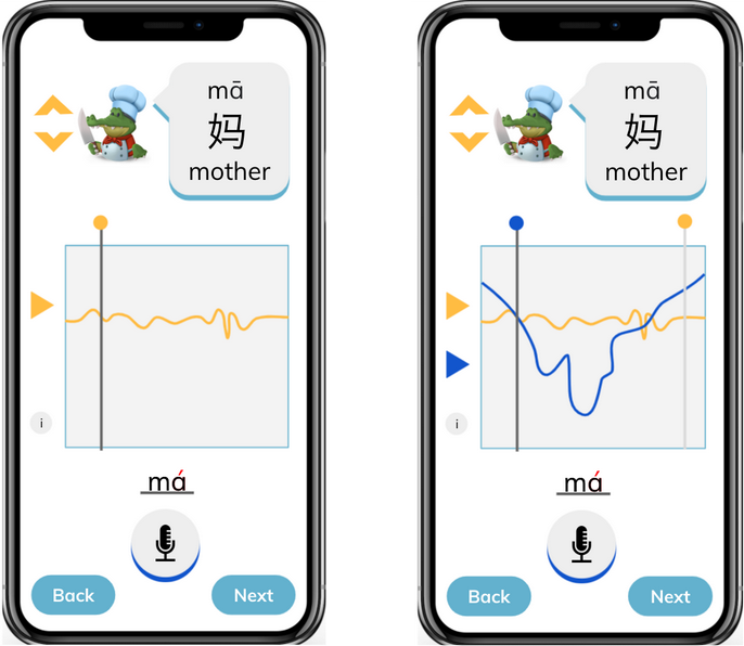
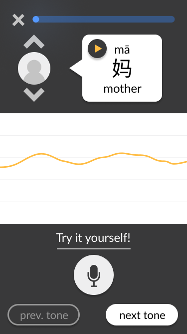
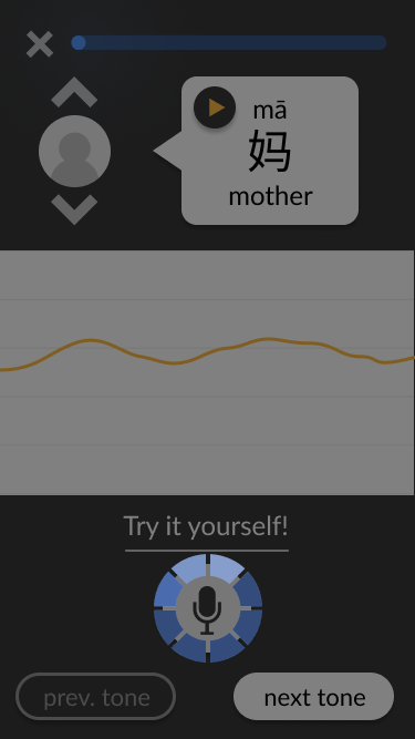
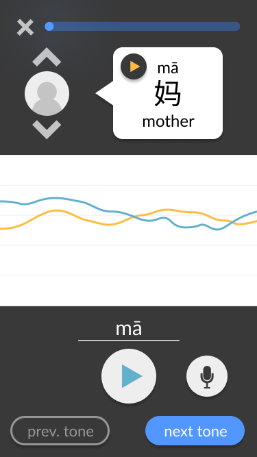
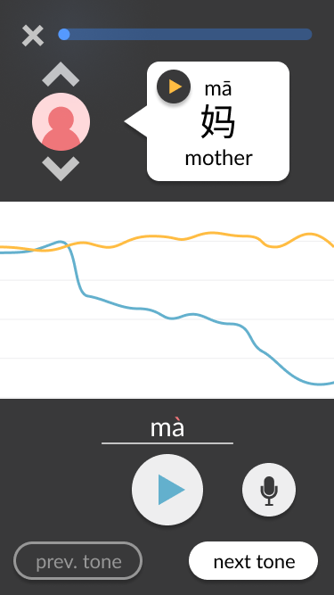
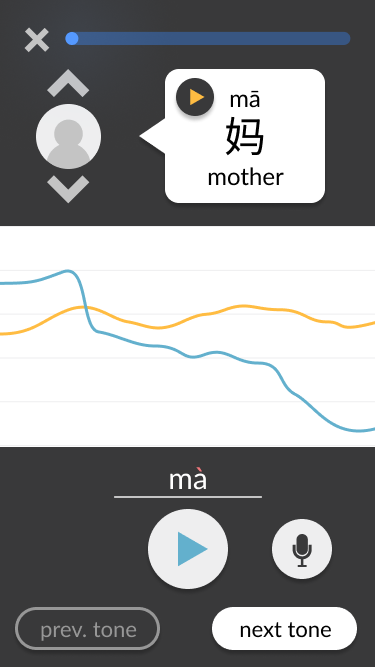
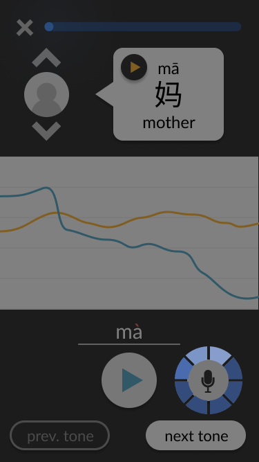
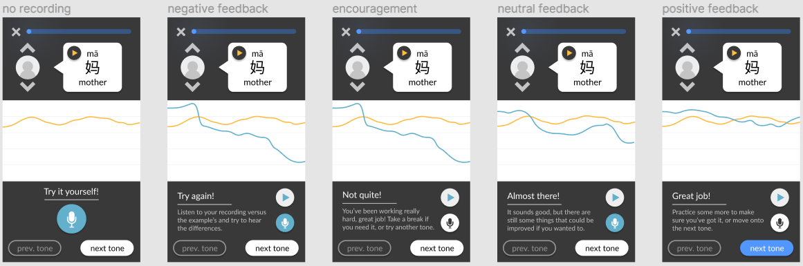
As the lead designer, I was responsible for making wireframes based on this concept. Apart from being cleaner than the collaborative mock-up, some key differences include:
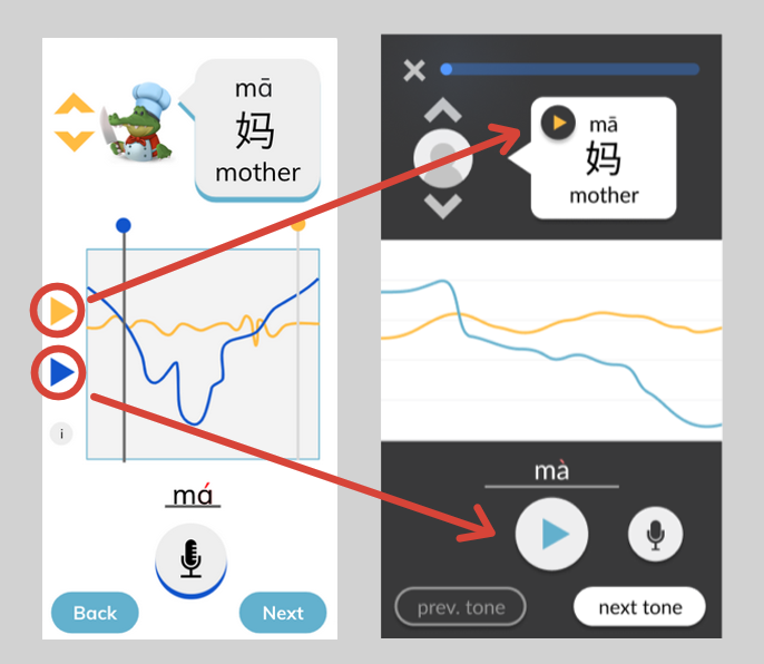
Moving the play buttons for the voice tracks from the pitch line area to the voice tracks’ “origins.” This simplifies the middle of the screen to focus on the visual pitch lines only, which is the key aspect of our tone-teaching solution. Additionally, it clarifies whose voice is being heard based on where the play button was pressed – for example, it is clear that the example voice is being heard when the play button is pressed within the speech bubble at the top. This contrasts with the user’s play button, which replaces the microphone button that they would use to record. Generally, the screen is split into three distinct sections: the top third contains the ideal example in text and audio form, the bottom third contains the user’s own recording attempts and navigation, and the middle third is non-interactable and visually compares both aforementioned audios.
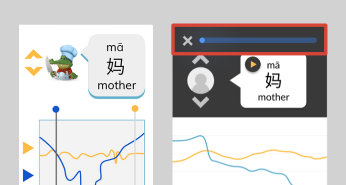
Adding a progress tracker and exit button at the top of the screen. In the bigger picture of a tonal language learning application, the pitch line approach would only be a part of the greater solution. Navigation between teaching modules would need to be considered from the start, since the pitch line module would not exist in isolation.
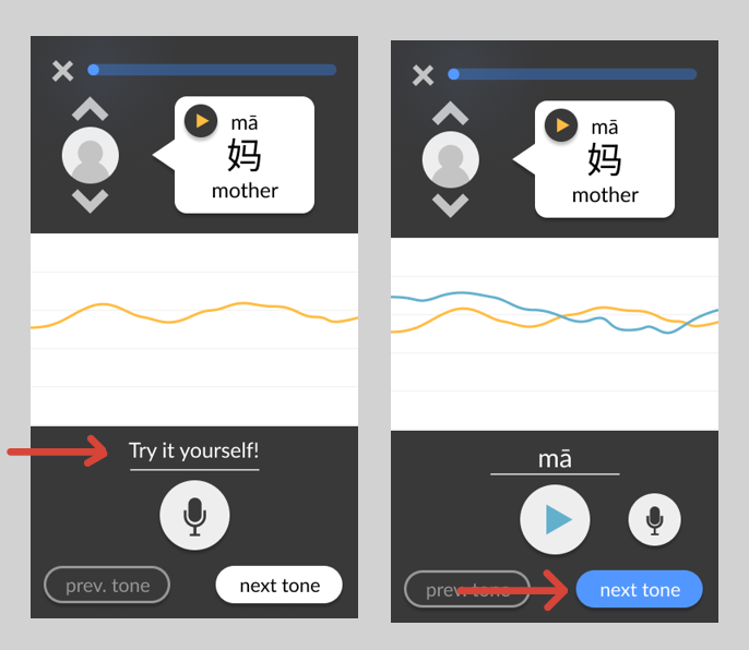
Adding prompts to guide the user through the interface. These include a written prompt encouraging the user to try pronouncing the tone when there have not yet been any attempts, and a change in colour in the “next tone” button encouraging (but not forcing) the user to move on once they have succeeded at pronouncing the current tone.
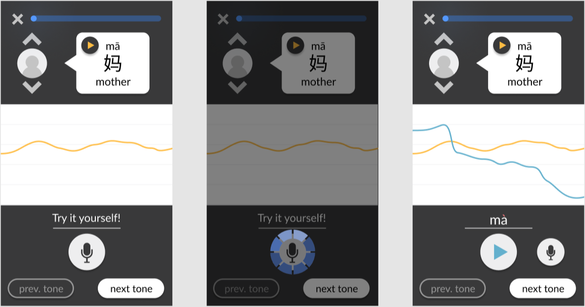
Adding simple interactivity to facilitate testing. For example, users can click on the chevrons to swap between different example speakers. When they click on the record button, a brief animation plays as if the app is actually recording, and then the pitch chart updates to include the “new” recording. These details contribute to a more realistic experience, allowing test users to immerse themselves in the design and provide more accurate feedback.
Screenshots from the final wireframes, made in Figma, are shown below. You can also try it out yourself.
User Testing
The Figma mock-up went through a first round of testing through a structured user walkthrough that I planned. The goal was to receive mostly qualitative feedback to pinpoint any large conceptual problems before refining the design enough for more rigorous, quantitative testing.
The walkthrough was structured and guided with a set list of questions, but also left open-ended enough for each user to contribute their unique thoughts and experiences. Users were asked to complete a set of short tasks with the wireframes, including switching between different sample voices, recording their own pronunciation attempt, and listening to their recording. They were also asked to voice their thoughts while going through the tasks and describe what they see, followed by some general questions at the end. Facilitators generally remained silent during tasks apart from providing the questions and prompts, to help avoid influencing the users.
None of the 10 users that were tested performed any errors with their given tasks, indicating that generally, the design was on the right track. However, there was some confusion when it came to specific design elements, such as the text above the user playback button.
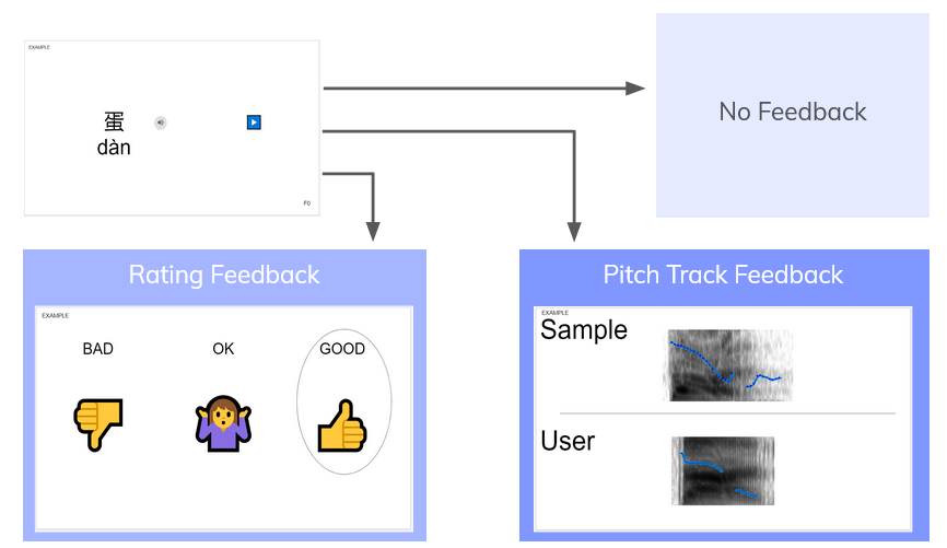
Additionally, user tests were run to determine whether the visual pitch line feedback was even preferred by users. It was compared against rating-style feedback, in which users were given a score (bad/okay/good) based on their pronunciation. Both feedback types were also compared against a control of no feedback. Users were given the opportunity to try out all three, which were generated behind-the-scenes by group members. 9 out of 10 users preferred the pitch line, and interestingly enough, 4 out of 10 users suggested – unprompted – that we combine both types of feedback.
Second Design Iteration
Based on the results of the user testing phase, the wireframes were updated to include the rating feedback alongside the pitch line feedback. The text which users found confusing – which was supposed to let them know what they were pronouncing – was replaced with direct feedback on whether their attempt was bad, okay, or good.
Additionally, I wanted to further refine the rating feedback system by researching what sort of information to include in the feedback, as some users did not like the wording used during the feedback tests. What would be the best way to encourage users while still informing them of their progress? Should a numerical rating be provided? Should negative feedback be provided at all?
I found that measurement feedback can promote performance but can also decrease the enjoyment of the activity. In high-skilled performance, detailed statistics can increase enjoyment. However, since the target userbase is tonal language learners, high-skilled performance should not necessarily be prioritized – it is the learners who are struggling who need the help. Regardless of how effective Tonami is at teaching tones, it must not discourage users on their language learning journey. One of the project’s most important goals is to create something that users will want to use and increase their motivation for learning. Thus, I went with a feedback system that focuses on messages of encouragement without a numerical score.
Additionally, I read that negative feedback “motivates players to repair poor short-term performances, while positive feedback is more powerful in fostering long-term motivation and play.” This led me to add an additional message that is shown if a user fails too many times in a row, to reassure and motivate them despite the poor performance.
Software Prototyping
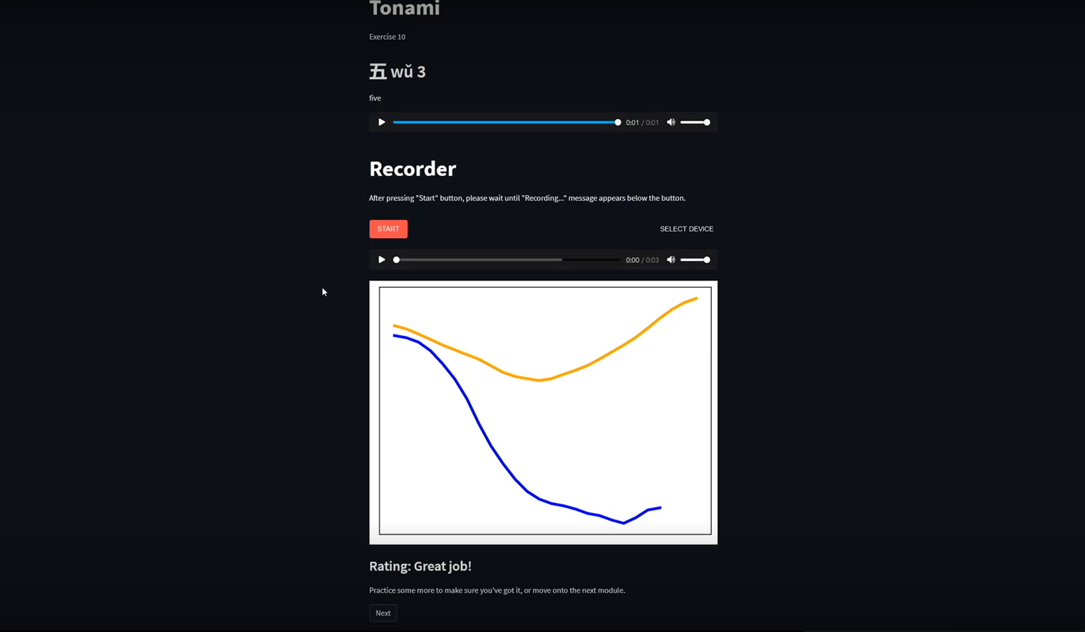
Due to the project’s time constraints, the team coded a web application prototype instead of a strictly mobile design. These constraints also meant that unfortunately, the prototype would not be able to match the wireframes directly for the current development cycle. However, this did not mean that my role as a designer was over – I instead focused on designing a user testing procedure for the prototype.
The main two goals of the user testing were to measure the usability of our solution, and to gather data for verification of the machine learning (ML) rating system. Usability was an interesting issue, since I knew from the start that the frontend would not look like the planned wireframes. Thus, it was important that tests relied on the general user experience and flow, not on individual elements of visual design. Tonami’s core interaction flow was simplified to the following general steps:
Be given a monosyllabic Mandarin word featuring one of the four Mandarin tones
Record an attempt at speaking said word
Receive feedback on the spoken attempt and repeat step 2 if desired
Move onto a new word and repeat steps 1 to 3
It was also important to reduce the amount of test facilitator intervention that was needed during the test, to avoid bias or potentially influence the user’s perception of the experience. This would simulate a real use case of a user opening Tonami for the first time without anybody being there to help them out. This meant there was a minimum amount of design elements needed for the user to be able to accomplish steps 1 to 4 multiple times without assistance. The required elements included a display of the given word (step 1), a playable sample native speaker recording of the given word (step 1), a button for the user to record an attempt (step 2), a display of the pitch track and written rating feedback (step 3), and a method of navigation to progress through multiple pages of words (step 4). I provided this list to the team members in charge of development and they were the elements that ended up in the prototype, serving their basic functions but not executed in high fidelity.
Some features present in the wireframes were not included in the prototype in order to save development time and keep the scope of the testing narrow. For example, the feature of switching between multiple sample native speaker’s voices was not implemented because it was not a part of the core user flow mentioned above. Although adding more features and sources of noise can be beneficial to user testing since it simulates a realistic environment in which the user must operate and detect signals, in this case it was decided against because of time constraints and focus on general user flow instead of a specific UI.
Screenshots from the prototype are shown below. Although the interface looks quite different than the ideal wireframes since it is an early software prototype, the key elements are there.
Prototype Test Design
The user testing design started with a list of things the team wanted to learn from testing. Some of these were directly drawn from the project’s initial requirements and constraints, while others were specific questions the team wanted answered about the prototype.
1. Does the solution lead to any improvement in tone production for non-Mandarin speaking users?
Unfortunately dropped due being unfeasible to test given the time constraints. This is because language cannot be properly learned in a single one-hour session, let alone tones which are especially hard for speakers whose native language is non-tonal.
2. Does the ML rating system provide accurate feedback to the user?
The second question, concerning the accuracy of the ML backend, could be tackled in a quantitative manner. By consensually keeping user recordings while they use the prototype, a direct comparison could be made between the rating provided by the ML system and a rating given by native Mandarin speakers. This required a survey to be designed and sent out to native speakers after all the user testing sessions.
3. Is the system generally usable for a typical user (non-Mandarin English speaker)?
4. Can the process be learned in a short amount of time by a typical user?
5. How do users feel about the wording of the rating feedback?
The third question was the main concern of the user test. I chose to implement a combination of cognitive walkthrough and task-based usability testing. The main task given to the user was to “use the software to improve their Mandarin tones,” while subtasks were hidden from the user but used to count errors. Thus, it could be observed if the intended subtask order was what users naturally followed without instruction, while the subtask completion rate and timing provided quantitative insights into the usability. An additional method of measuring usability was through the addition of a post-test survey, administered immediately after reaching the final page of the prototype. The first part of this survey contained a System Usability Scale (SUS), which quantitatively measures users’ perception of usability. The second part of this survey aimed to answer the fifth question about the wording of the feedback by providing the users with a list of words which they could select to describe each of the possible ratings, similar to the Microsoft Desirability Toolkit. The aim of this was primarily to see if users perceived the feedback to be encouraging or discouraging, while additional words could provide insights as to how the wording could be further improved.
Considering benchmarks was another important step in the experimental design process, particularly for the quantitative measures. Across 500 datasets it was found the average SUS score was 68, and across 1100 tasks the average task completion rate was found to be 78%. These two values were used as benchmarks for this user test.
Key Findings & Next Steps
The average SUS score obtained from the testing was a 78, which exceeded the benchmark of 68. Task completion rate for the first encountered word was 100% for all subtasks apart from one, which also meets the benchmark. Some findings include:
The wording of the rating feedback achieved its requirement of being encouraging, however users found it vague. Users would like more specific feedback on how they can improve as opposed to generic pointers, so a next step could be to write tips based on the intended tone and the user’s ML-classified tone.
9 out of 10 users believe that Tonami is somewhat or extremely helpful for Mandarin learners. Although it is good to hear that users believe that the tool is helpful, it would be good to run some longer-term tests to assess whether improvement is actually happening over time.
Some users correctly guessed that the dotted lines in the pitch contours were interpolations due to missing pitch values (such as vocal fry). However, this was not obvious to all users. Further investigation into how to display this intuitively should be done.
Overall, I believe Tonami was a success given the time we had to work on it. The testing results indicate that although there is plenty of room for improvement, the project is on the right track. I learned a lot during the course of its completion and would love the chance to continue working on it someday.
Acknowledgements
Special thanks to my fellow group members – Robyn Ching, Lina Choi, Amy Lu, and Sabrina Yu – the best groupmates I could ask for! Thank you for bringing your individual talents and perspectives to this project. Additionally, I would like to thank our advisors, Professor MacDonald and Professor Dunbar, who provided valuable advice and feedback.